![]()
lyndale renovation 2015 & 2016
paint, cabinets, counters & disaster
| post 7 • page 1 | |
| go to page > 1 | 2 > >go to post > 1 | 2 | 3 | 4 | 5 | 6 | 7 | 8 | 9 | 10 | go to > master plan |
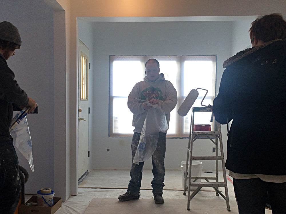
Early February 2016 —
Christian, the point man for the painting crew is in the center. His comrades are to the sides and they are wrapping up day one of painting.

Dude!
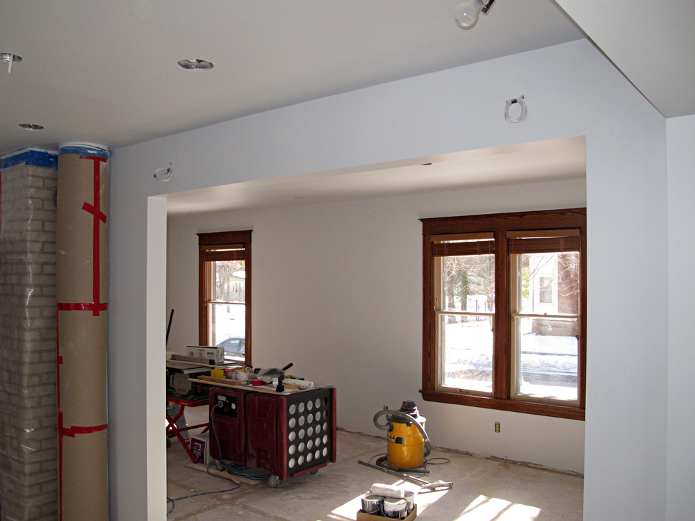 Facing south into the dining & living room areas —
The windows are temporarily revealed, giving us a chance to critique the new paint job alongside the wood.
Val and I are adjusting to the dramatic difference between the original rosy-peach color and the new, cooler gray.
This much is certain: with greater contrast, the warm wood color explodes out of the gray.
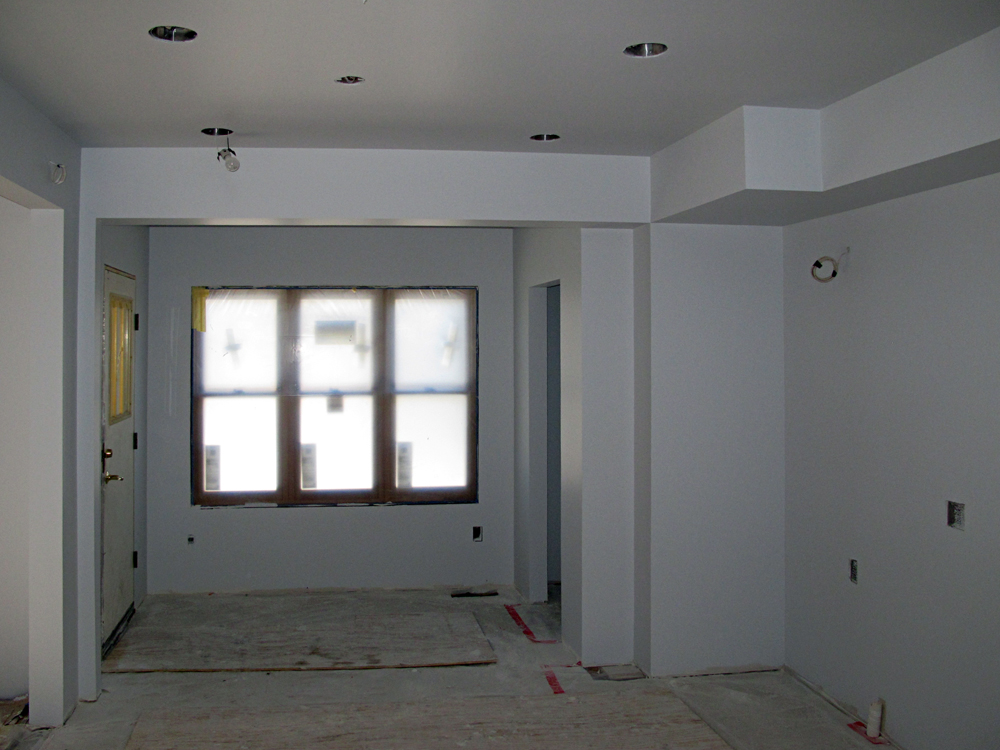 In the kitchen facing west —
Far more than the old paint, the new paint seems to change depending on the time of day. Natural light vs incandescent light and even the angle from which the paint is viewed seems to change the look.
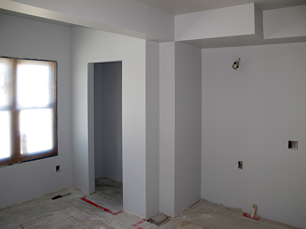 Kitchen closet & fridge area —
The new paint certainly makes the walls look super clean and precise. The way the angles of the soffit pick up shadow is pretty great, I think.
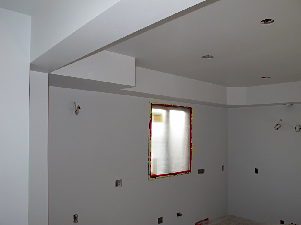 Kitchen north wall —
Here is a last glimpse of this area before cabinets are installed.
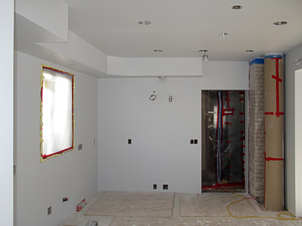 In the kitchen facing east —
The mortar color on the chimney is a perfect tone match for the new gray walls and looks great.
The sand-colored brick against the gray looks great too.
I can hardly wait until the protective covering is taken off the silver-colorer circular duct. The silver and gray will surely rock!
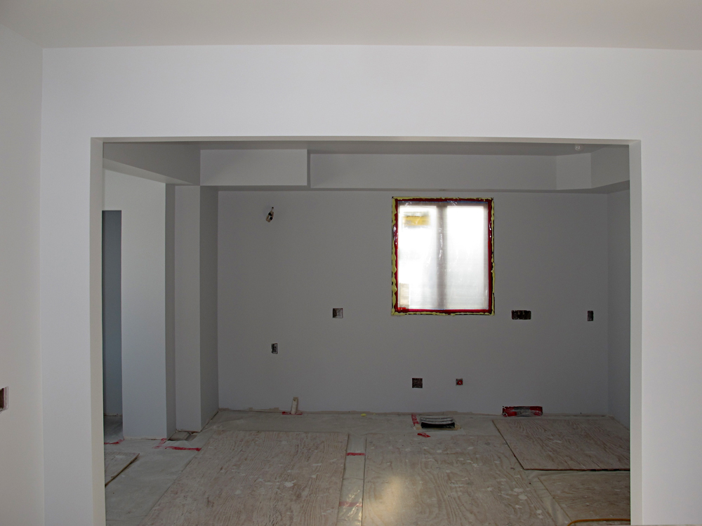 Facing north into the kitchen —
Here's the last view of an empty room; the base cabinets arrive tomorrow.
 Facing north into the kitchen —
Cabinetry begins: Here's the back side of the island prior to the counter top install. North and east-wall base cabinets are in place as well.
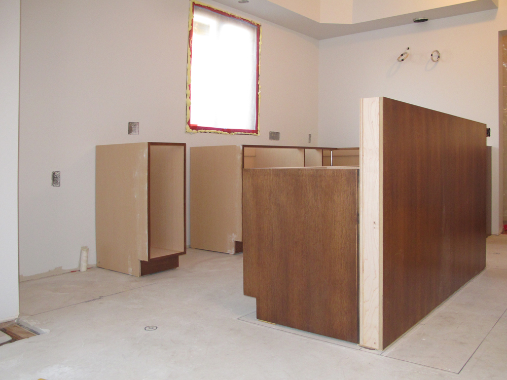 The quarter-sawn oak veneer is gorgeous. Together with a deep-gray Ceasar-Stone countertop, and a concrete-style floor, this wood
ought to look stunning. Our combination of industrial and minimalist styling is, I think, a design home run.
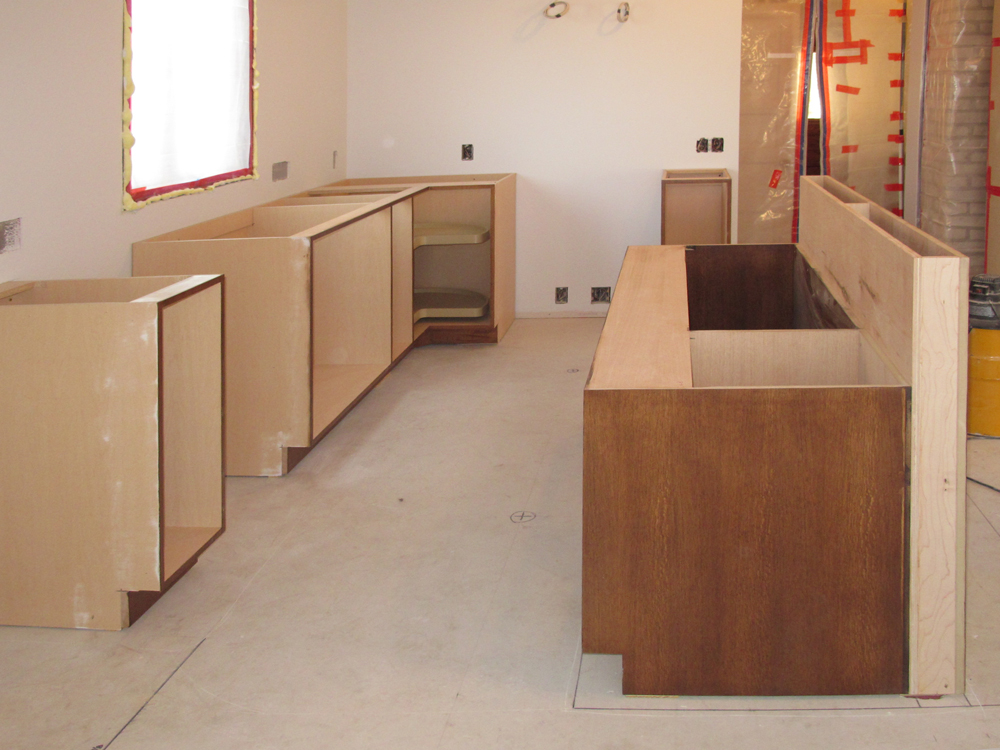 Facing east in the kitchen —
The space between the north-wall cabinets and the island is ample. Walking through this area doesn't seem at all crowded.
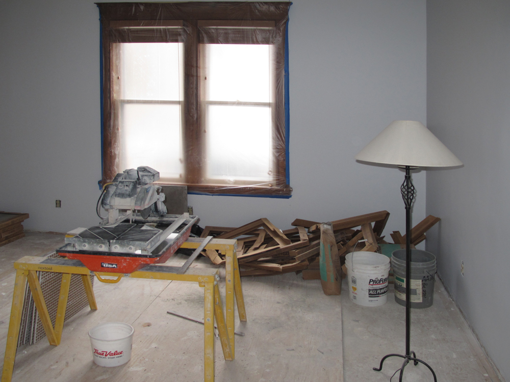 Another mess during an all-new faze —
The tile install is beginning. Shown here is the tile guy's wet saw. Visible on the left side of the saw is a stack of our large (2-foot square) tiles.
Our original plan for a poured-concrete floor wasn't feasible, so we chose tile that seems really similar to concrete.
No doubt the built-in patina of this tile will not be everyone's cup of tea, but this ain't their kitchen.
 Here you go; rugged, gray, concrete-like...perfect!
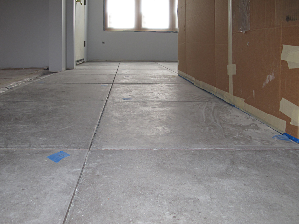 I'm stoked about the floor and can't resist another photo.
It's covered with dust, it has no grout, but already I know I love this.
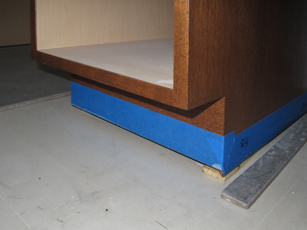
A new kitchen speed bump —
Despite leveling the floor, some shimming was required on the base cabinets so that the countertop height will be absolutely precise. Normally, shim work would be covered by a trim piece, such as a 1/4-round. However, our minimalist design is all about right angles and no 1/4 round. Architect, Scott, said it succinctly: Minimalism is far more difficult to execute than traditional design—banishing molding requires that all elements meet up just so.
To avoid the use of molding at the point where cabinet meets floor, the cabinet toe-kick area (shown here) will be modified. Tile will come precisely to the edge of the cabinets. A thin line of sealant that looks lust like the grout will protect the bottom of the cabinets from moisture on the floor, and there will be no trim strip to interrupt the clean right angle of floor and cabinet.
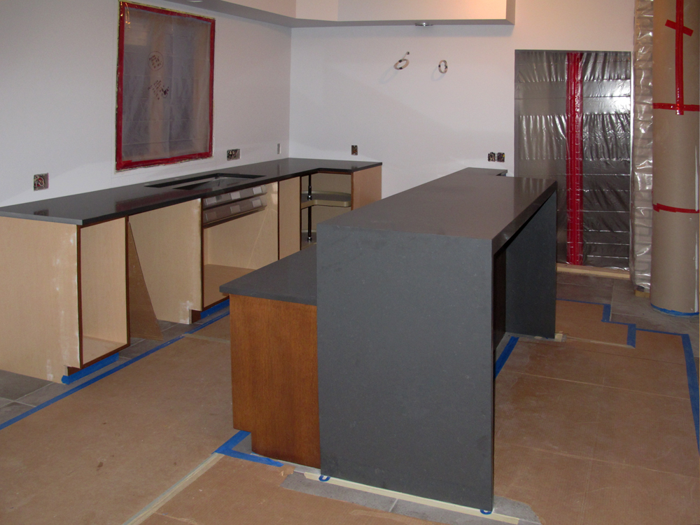 The countertops arrive —
Now we finally see all of our colors and textures together. Choices were well made, I think. The rich-gray countertop is a perfect tone match for the gray concrete-style floor, and the red-toned wood works with, and warms up, the grays beautifully.
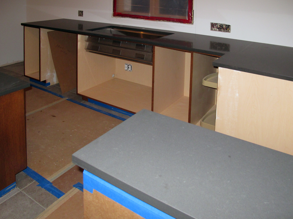 Another gratuitous countertop pic.
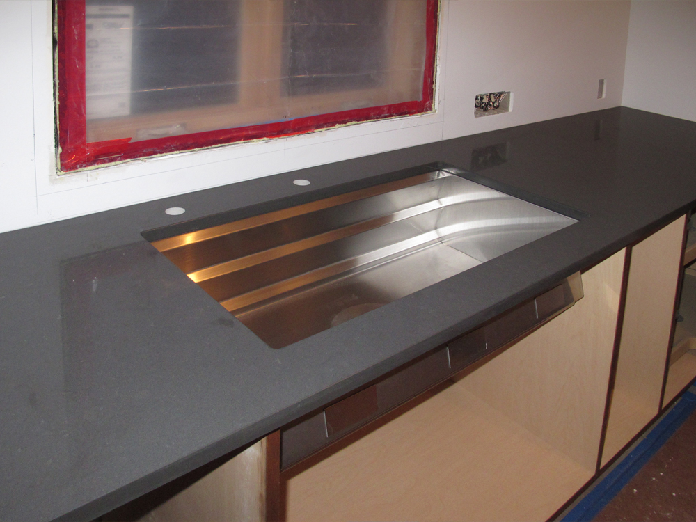 The gray countertop material looks great with the stainless-steel sink. Soon the appliances will arrive, adding another dose of stainless.
| top |