![]()
lyndale renovation 2015 & 2016
upheaval
| post 2 • page 2 | |
| go to page > 1 | 2 > >go to post > 1 | 2 | 3 | 4 | 5 | 6 | 7 | 8 | 9 | 10 | go to > master plan |
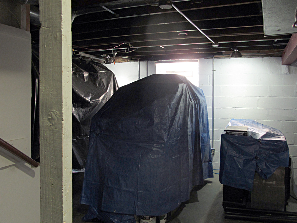 The Basement facing south —
Cabinets, bikes and other objects have been arranged like little islands and covered.
Work in the rooms above causes plaster, wood chunks and dust to rain down into the basement.
Frequent brushing-off of the tarps, and shop-vaccing on the walk ways through the islands keeps the basement pretty clean.
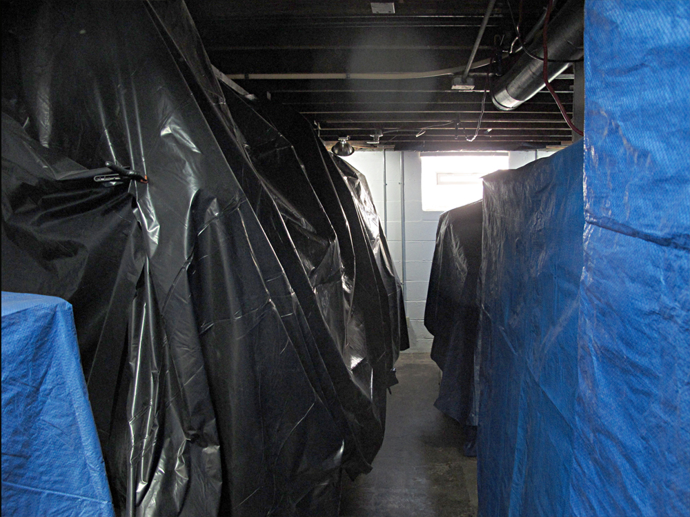 The Basement facing south —
Here's a sad, sad photo. Bikes, hung from the ceiling, are encased in black plastic.
This is normally a heavily-used winter work-out area. It's now out of commission until the project's completion.
To see the basment as it was before, and will be again, click here.
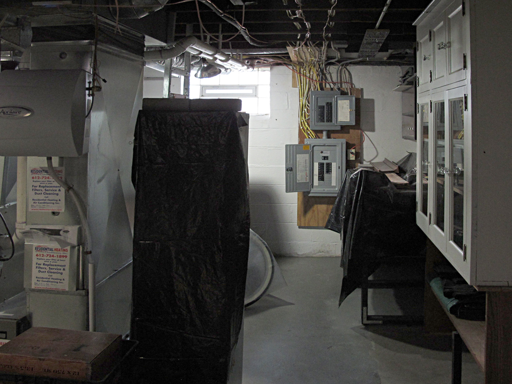 The Basement facing south from the laundry room —
More cabinets and the work bench are covered in plastic.
Much will happen to the electric boxes on the south wall as the first floor wiring plan changes dramatically.
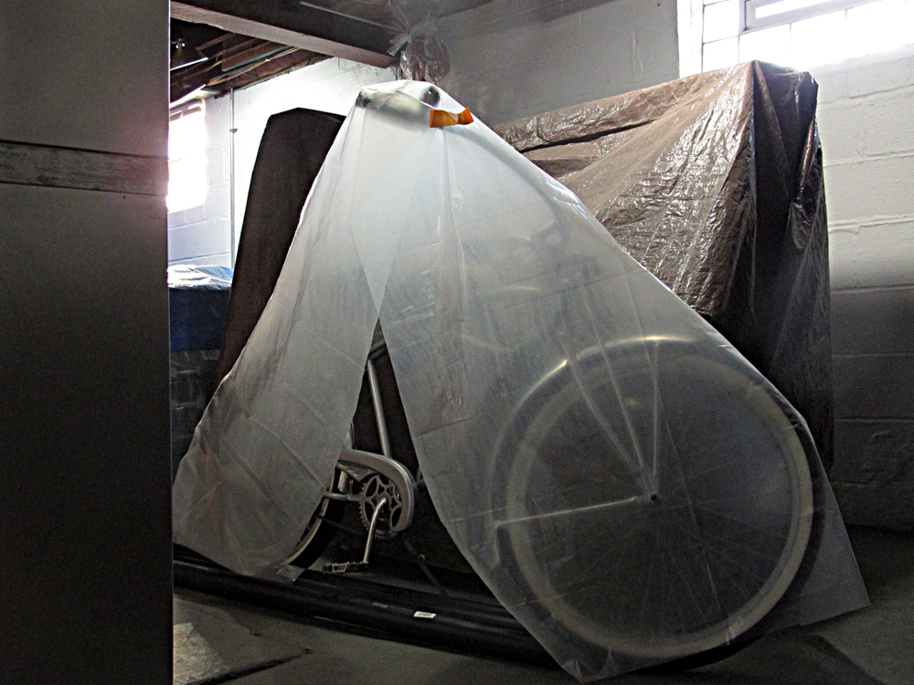 The Basement facing south from the south side of the furnace —
Here's Sylvia, the pin-up girl of the bike family. She's the one bike not hanging from the ceiling by the east basment wall.
She's also the most accessible of the bikes, yet least likely to be used in winter weather. She's a glamour girl, not a sled dog.
To see Sylvia, properly turned out, click here.
 The Garage —
My God, more stuff!
 The Garage —
When I look at this, I wonder if Val and I are hoarders.
Well, if we are, at least we are tidy hoarders.
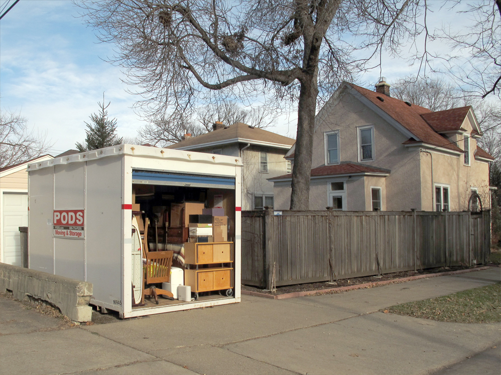 The POD —
All of the living room, dining room
and front foyer furniture is in here.
Closest to the POD door is the mud room furniture and odd items; dehumidifier, ironing board, etc.
BTW: The POD makes me think of a '90s Christian nu-metal band by the same name. Check 'em out: click here
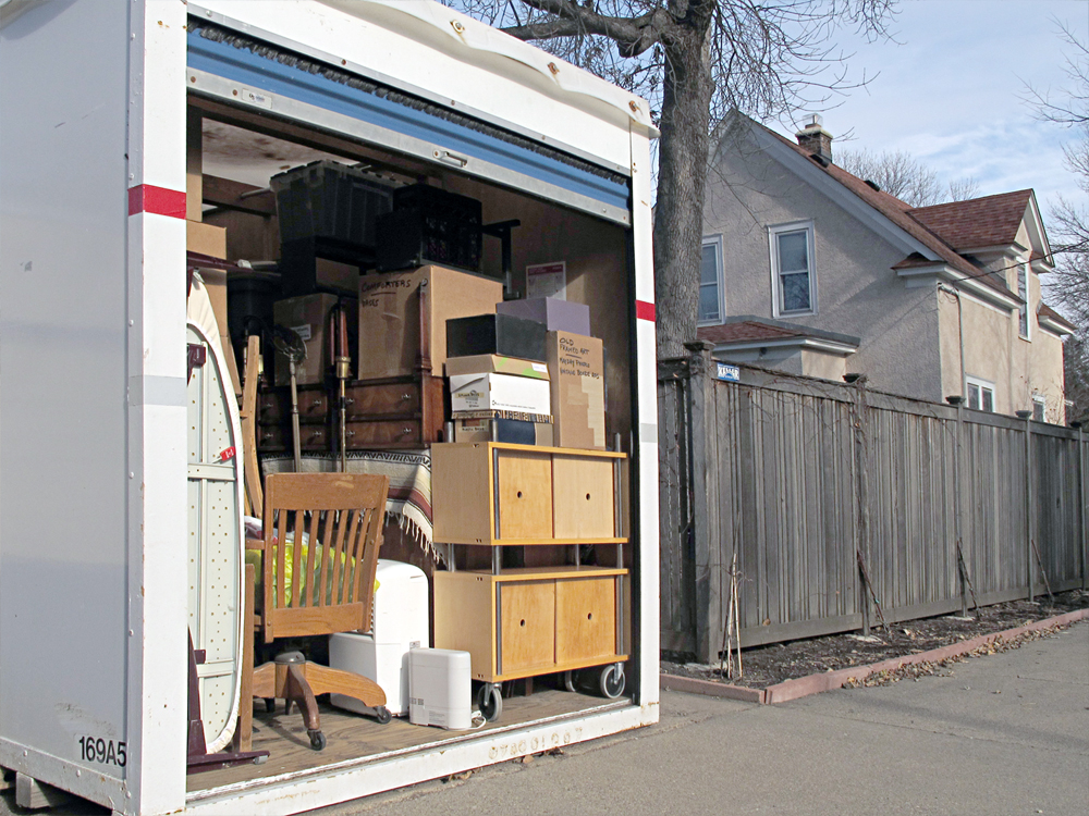 The POD —
At first I was disturbed to have our stuff so close to the sidewalk, but after a couple of weeks,
and no evidence of anyone messing with the POD, I'm over worrying.
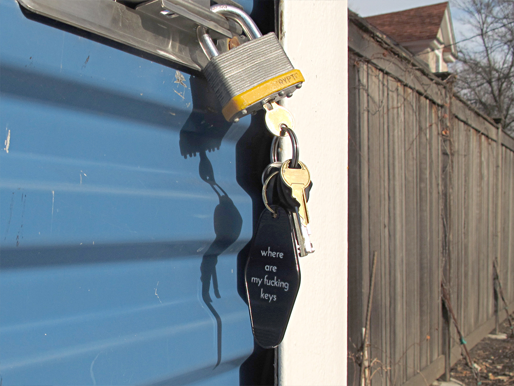 The POD —
I am, however, diligent about checking the POD's lock and general condition.
Yes, my keychain is really that vulgar.
 The POD —
Between the POD and the garage we've stashed our trash and recycling. There's room to wheel the bins past the east side of the POD on pick-up days.
The price to be paid for this arrangement is the loss of two off-street spaces for cars. I suppose this means there'll be tons of snow and multiple
plowing/parking restrictions this winter.
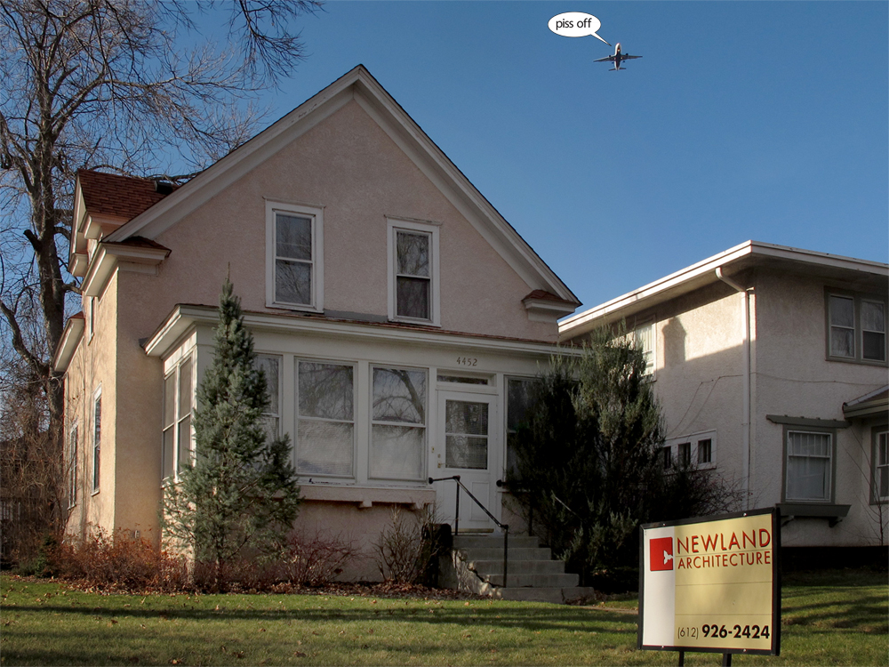 The House Front —
Next to liver spots, nothing makes me feel more like a grownup than having a renovation sign in the yard.
All joking aside, architect Scott Newland has been fantastic in every way. For some oohs and aahs, here's a link to his website:
Scott Newland Architecture
When the dust settles from our current project, we'll turn our attention to the exterior.
To see some of our prelimnary ideas, click here.
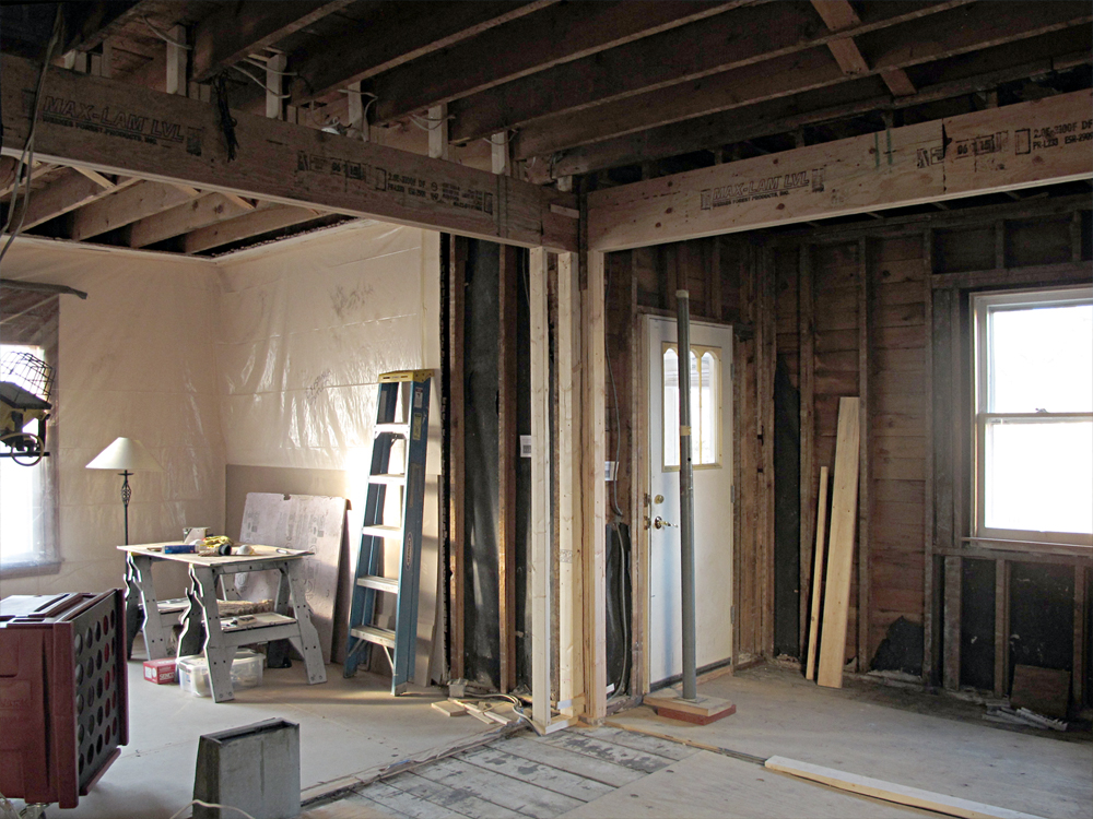
Kitchen game-changing discoveries —
• Our original plan was that there'd be no change to the opening between the main kitchen and the back portion of the kitchen.
• The original opening was much lower than the opening show here.
• Since demo revealed horribly make-shift framing in this area, change was essential—that change included higher placement of the header.
• The opening to the living room was also going to be lower, roughly matching the height of the back door shown.
• The living room opening was to be trimmed to match existing molding in the living room.
• Now, given the beauty of the extra-tall openings, we can't bear to lower them to accomodate old door heights and trim.
• Our solution: leave both openings tall, skip the upper trim and connect the kitchen and living room designs using matching baseboards only.
 The Kitchen facing west —
Here's another view that supports our idea of going high with the openings.
The higher the opening, the more we capatilize on the the three new windows that are coming to the west wall shown here.
 The Kitchen facing west —
The change we'll adopt has a trade-off: To gain the opening height, we loose the opening trim.
The upper trim would be lovely but extra space and light can't be beat, and we do think that continuous living
room and kitchen baseboards will create adequate design connection between the two areas.
Tomorrow we meet with architect Scott and contractor Edgar for their valued opinions. But, I think it's a done deal.
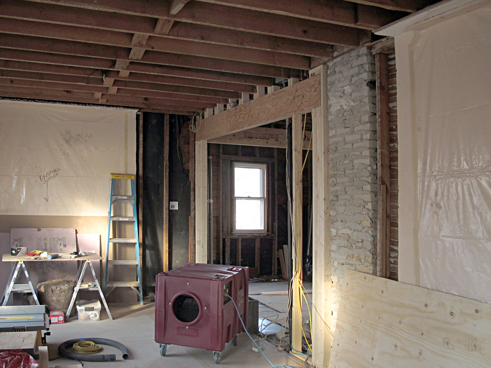 The Living Room/Dining Room facing west —
Same as with the view from the east end of the kitchen, when looking this way, a higher opening will
add great impact to the new kitchen windows. It would be madness to lower this opening.
 The Living Room/Dining Room facing south —
A hiccup on this project was a delay in the arrival of this wierd thing. It is a big frickin' air purifying thingy and it made a world of
difference to poor
Val, who sucked plaster dust for a couple of days and felt like shit as a result.
Contractor Edgar was in a bind because of a snafu shipping this device to us.
He stop-gapped with a rented machine; Val toughed it out for a few days; the device
finally arrived, and now everyone can breathe and sigh in relief.
 The Kitchen Floor —
This project produces all sorts of fleeting and, I think, intiguing things to look at. Take this shot for example. How many times will you see your kitchen outlets scattered across the floor instead of safely ensconsed in a wall?
| top |